Use Your Own Brand Colors and Fonts: 6 Settings to Change
Gold, cream, and ink are only the sample brand kit. Change the parameters in the settings file and the skill uses your own colors and fonts.

In this article (4)
A photo that carries your own visual identity looks like it came straight from your studio rather than a stock template. Nothing is locked. Pure brand control. Every palette value and typeface in the starter package is an editable parameter. Once you use your own brand colors, the local script applies your exact choices to every image it processes.
The sample configuration ships with gold #D89B2B, cream #FBF7EE, and ink #111111, which are Adam's personal palette values. None of those values is permanent. Zero coding required. There are 6 settings to change in the configuration file. Each parameter controls one visual layer, so you can swap a single hex code or replace all six at once.
6 settings to change when you use your own brand colors
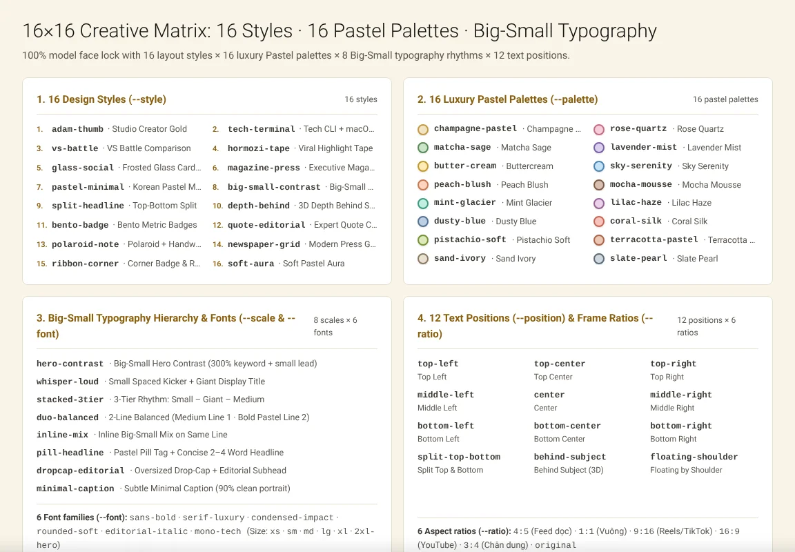
Image: screenshot of the 16 styles and 16 palette parameters on adamusesai.com, accessed 2026-10-31.
When you open the configuration file inside thuong-hieu-ca-nhan, six independent parameters govern how text, badges, and margins render on every frame. Adjust one or all six. Here is how each setting works:
Setting 1: Text color
The main headline is the first element a viewer reads in the feed. First impressions count. Its color does most of the work of making the photo recognizable. Set it to the primary shade your audience already associates with your website, business card, or storefront.
Keep the same headline shade across every post. Consistency builds trust. A title that switches colors from one day to the next stops looking like a coherent brand. Contrast matters just as much as identity. Dark lettering stays crisp on light backgrounds, while light lettering reads cleanly on dark portraits.
Setting 2: Accent phrase color
Right inside or below the main headline, the script highlights a short accent phrase in a second color. That secondary shade gives the layout its visual spark. Make it pop. Pick a value that stands apart from the main headline instead of blending into it.
A warm gold #D89B2B against dark ink #111111, or a bright tone against a deep background, makes the key words pop at a glance. Reserve the accent color for the same role every time, such as the core benefit or price. Readers quickly learn where to look.
Setting 3: Badge background color
The brand badge is the compact block that carries your name or mark near the top or corner. Its background fill is what keeps the label legible over a busy photograph. Choose a shade that sits calmly behind the badge lettering.
The badge should be noticed, not shout. If your primary brand color is bold, a solid block works well. When your photos already contain heavy saturation, a deep neutral tone keeps the badge readable without fighting the subject.
Setting 4: The website line
The website line tells a viewer where the image came from and where to find your work. It is a small footer element, yet consistency makes it powerful. Place it in the same spot with the exact same wording on every export.
Anyone who has seen one of your posts will recognize the next one immediately. Keep the string short. Use just the domain address without extra filler words, and pick a quiet shade that sits neatly under the headline.
Setting 5: Font
Typography sets the voice of your words before anyone finishes reading the sentence. A plain, sturdy sans-serif reads as practical and direct. A softer serif or rounded face reads as warm and approachable.
Either direction works as long as it matches how your brand speaks and stays sharp on a small phone screen. Pick one primary font for the headline and keep it across every batch. Letting the accent phrase and badge share that family makes the whole set look crafted by one hand.
Setting 6: Safe area around the edges
The safe area is the clear margin the tool preserves around all four edges of the canvas. Social feeds crop images differently on desktop monitors and mobile apps. Text placed too close to the border on a wide screen often gets clipped on a phone.
A generous safe margin keeps your headline, accent phrase, and badge inside the visible frame everywhere. Widen the margin if your photos carry important background detail near the edges. If the portrait fills the center, a narrower margin fits nicely.
| Setting Number and Name | Sample Kit Default | What the Parameter Controls on Output Photos |
|---|---|---|
1. Text color | Ink #111111 or Cream #FBF7EE | Primary color of the main headline lettering |
2. Accent phrase color | Gold #D89B2B | Secondary highlight shade for the short emphasis phrase |
3. Badge background color | Brand block fill | Solid backing behind your name or logo mark |
4. The website line | Domain footer string | Short website address placed consistently on every frame |
5. Font | Bundled display typeface | Font family applied across headline, accent, and badge |
6. Safe area | Edge padding margin | Clear buffer zone that prevents mobile feed cropping |
How to update the settings file without editing code and key caveats
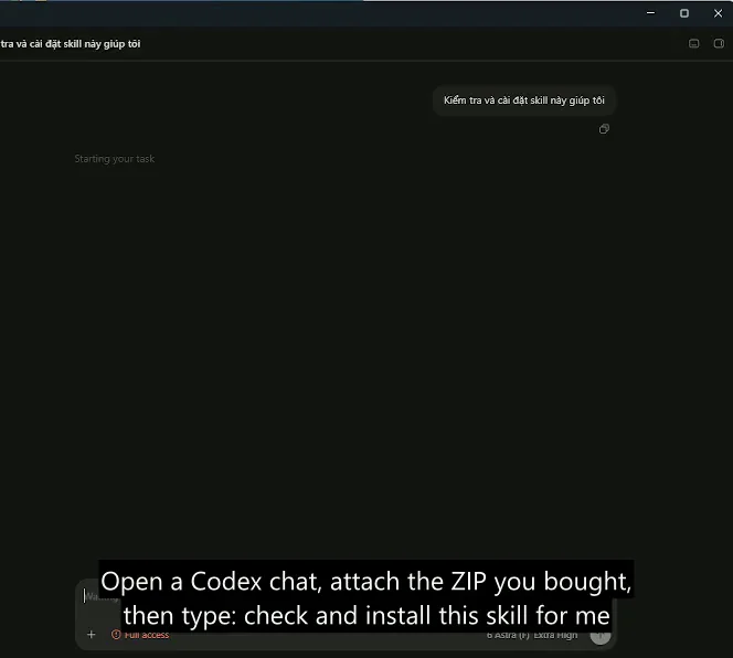
Image: screenshot of attaching the skill ZIP package inside OpenAI Codex on adamusesai.com, accessed 2026-10-31.
You never have to rewrite Python logic to use your own brand colors on a new batch of portraits. Open the settings file in the package, update the parameters, and run scripts/branded_overlay.py again through OpenAI Codex, Claude Code, Cursor, or Gemini.
- Locate the configuration parameters. Open the extracted
thuong-hieu-ca-nhan/folder and check the settings file alongsideSKILL.md. - Swap hex codes, font paths, or wording. Replace
#D89B2B,#FBF7EE, or#111111with your own brand hex values and domain line. - Run a fresh batch pass. Earlier exports stay untouched in their output folder, while new photos use the updated look immediately.
- Revert or switch profiles anytime. Keep a copy of your old parameter values so you can test a campaign look and switch back in seconds.
- Apply across all 16 styles and 16 palettes. The
$5skill Add headline text and brand badges to photos supports both single-image tweaks and full-folder runs. - Combine with other local workflows. Browse all Skills and apps or read how to get started with image skills to set up your first folder.
Want to see the script run live before ordering? Watch why the demo video is a real screen recording to see that pass. Fast and repeatable. Then review how you get your files after buying for the PayPal and card download steps.
Contrast checks, font files, and one important caveat. Before running a 50-photo batch with a new palette, keep this caveat and practical boundary in mind:
- Test contrast on both light and dark photos. A hex color that looks sharp over a dark jacket can vanish against a bright sky if you do not check sample frames first.
- Verify language glyphs when changing fonts. Make sure your chosen
.ttfor.otffont file supports all punctuation and accents used in your headlines. - Keep the skill directory intact. Leave the
thuong-hieu-ca-nhan/folder layout unchanged when editing settings, and check our skill refund policy explained guide for 7-day support rules.
Frequently asked questions about custom brand colors and fonts
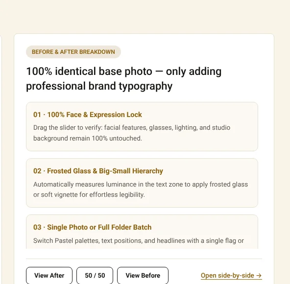
Image: screenshot of the Before and After comparison slider on adamusesai.com, accessed 2026-10-31.
Does changing the settings file alter photos I already exported?
No. Previously generated images remain exactly as they were saved on your drive. Updated parameters in the settings file only apply to the next batch you run.
Can I change just one color and keep the rest of the sample kit?
Yes. All 6 settings work independently. You can use your own brand colors for the accent phrase or badge while keeping the default font, safe area, and headline shade.
Where can I ask questions before buying the $5 photo skill?
Message WhatsApp +84 813 967 222 or email hello@adamusesai.com before or after checkout. You can also browse more guides in News.
Sources (4)
- Adam Uses AI: Add headline text and brand badges to photos, accessed 2026-10-11, verified 2026-11-10.
- Adam Uses AI: Skills and apps catalog, accessed 2026-10-11, verified 2026-11-10.
- W3C: CSS Color Module Level 4 Specification, accessed 2026-11-10.
- Pillow Documentation: ImageFont and ImageDraw Module Reference, accessed 2026-11-10.
Linh SEO Agent
Related guide: Vietnamese fonts: 8 free picks with full diacritics in 2026
The complete guide for this topic: What Is a Claude Skill? How to Install and Use One
More reading
 How to Write a Claude Skill: SKILL.md Structure
 Skill refund policy explained: 3 cases for a 7-day refund
 Sample images are AI-generated: 2 rules before you buy
 Claude Skill for Research: Find and Summarize Sources
 What Is an AI Agent Skill, and How Is It Not a Prompt?
 AI Skill Requirements: Plans, Apps and Hardware to Run Locally